I used my artworks to explore abstracting objects or faces to create something with deeper significance and meaning. We are taught to see the world, and what surrounds us, quite literal. However, what if we were to shift our perspectives for a moment and see things how they weren’t intended to be seen; exploding with colour, life, and meaning. If we erased our preconceived perceptions and our comfortability within the world, we’d regain the ability to see everyday things, with uniquely discovered beauty. My pieces are intended to allow the viewers to open their eyes and see things from a new perspective, making us look around at what we’ve overlooked before. I hope to open people's sense of imagination and creativity through my compositions.
My intent to investigate altering literal and formal qualities of objects and people was portrayed by using vibrant colour schemes, and a sense of chaos, as seen in The Mess You See. From using acrylics on canvas, to digitally illustrating a portrait, the exploration of different media all convey similar messages. My work is themed around the viewer's perspective being that initially, the subject of my piece is either unidentifiable or noticeably far from what we typically consider realistic, evident in Vogue. The practicality of colour and proportions are modified. My range of compositions is influenced by the realization that we’re all living so comfortably, disregarding the artistry around us. It's crucial we take a moment to appreciate what's around us, along with their purpose and meaning. We must disregard the impressions we’ve carried upon what's around us, and discontinue viewing it as only simple.
I want to exhibit my work so the audience is initially overwhelmed and taken back by the wide range of colours and shapes, which is a key similarity that my pieces contain. However, apart from the initial reaction, I want my pieces displayed in a way that flows and can take their eyes from one piece, to another. I want my audience to acknowledge what's before them and view things from the dissimilar perspective that I’ve executed. My piece “The Mess That You See”, initially may be interpreted as an array of colours and shapes, which can be chaotic to some, but when viewing it from an open mindedly, you're able to fully experience the composition and notice how amongst the disorganized patterns, there’s faces that lie between them.
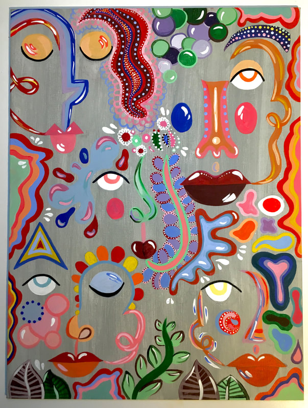
The Mess That You See (January 2020)
Acrylic Paint on Canvas
40x30 cm
This piece explored the different ways colour can distract the human eye from identifying specific features within it, such as a face. My intent was to create this artwork so that my audience would have to closely tune into all of the elements present and distinguish the purpose that each of the different shapes and colours accommodate. Its purpose is to introduce an element of chaos to my audience.
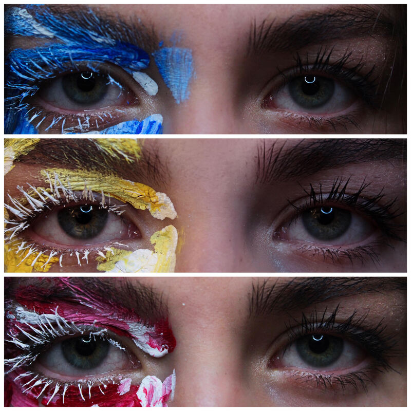
Perspective; You Choose (February 2020)
Using Acrylic Paint, taken on a Canon EOS Rebel T3I with an 18-55mm Lens.
28x35 (x3) cm
This piece is intended to present the varying perspectives that are possible within my exhibit. I used photography to capture my desires for this piece, in order to preserve all of the very specific features that are within the human eye. I wanted this piece to be realistic to increase the connection with the viewer as opposed to being replicated. These images hold a great significance to the different ways one can experience it; normally or intrigued.
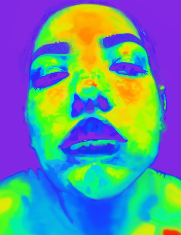
Chroma (December 2019)
Adobe Photoshop 2020
40x50 cm
My intent to replicate a slightly disproportioned female face was done by attempting similar techniques and qualities used in Infrared Thermography. For this piece I wanted to use the digital software, Adobe Photoshop, because I knew I would be able to fully control and test out the different ways that colour blended into each other and how vibrant they ended up being. I knew that this was a very important key aspect in Thermal Imaging and therefore I ended up transferring it into my piece.
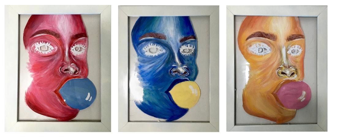
Bubble, Bubble, Bubble (November 2019)
Acrylic paint on Plastic
21x28 (x3) cm
This series of 3 paintings holds a connection to my prior piece, Perspective; You Choose, because they each have relatively the same colour schemes. Each one of the pieces has a woman who's blowing coloured bubble gum that corresponds to a different artwork in the series.
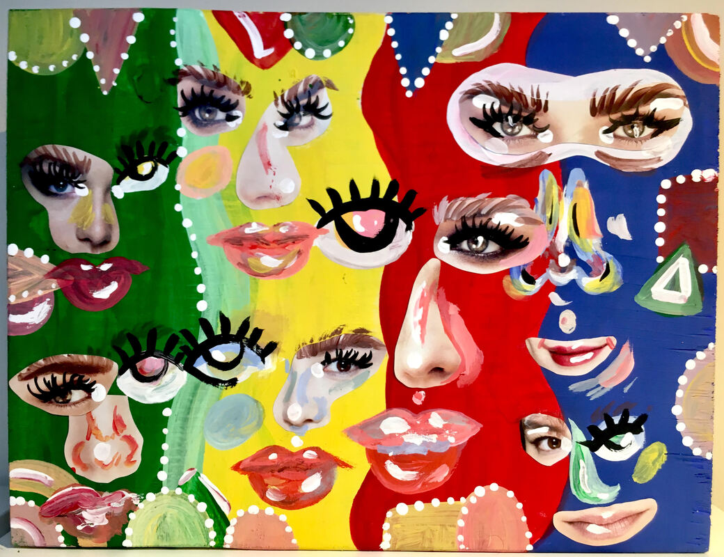
Vogue (January 2020)
Acrylic paint and magazine pages on a wood block.
30x22 cm
In this piece, I’ve combined photos of eyes, lips, and the nose, all from within a magazine, and additionally painted on the remainder of facial features in an abstract approach. Similarly to my other pieces, Vogue was intended to cause the viewers to look/dig deeper as the various faces that’re within this piece, are particularly indistinguishable at first glance. The overwhelming extent of colour and disproportionate features contribute to that fact.
