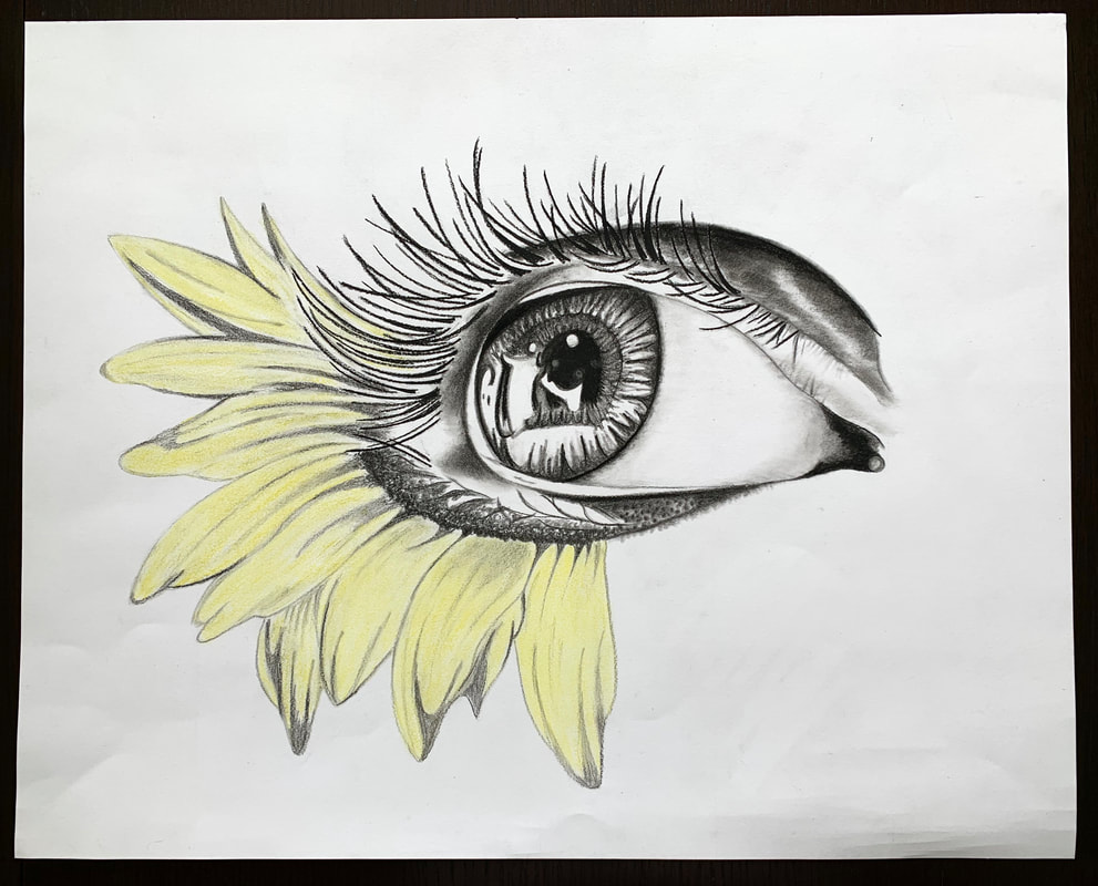
As someone who often over analyses and overthinks the majority of choices in my life, my intention while forming this exhibition was to let go and portray my love for art. When I came across something that inspired me, a new media to try, or just purely had an idea of what I wanted to do, I would begin the piece. Commonly my work involves themes in life such as self love, nature, and life. My hope is that no matter who you are looking at this exhibition, that you can leave having related to one piece or more in your own way, even if it is just a feeling of happiness or the new urge to go out and try something new.
A recurring element of my pieces is nature. I have always been taught to love our earth and I grew up spending plenty of time exploring outside. This has definitely fueled my common gravitation towards expressing natural beauties through my art. As a central focus I often add details of nature because I feel that there are numerous symbols associated with trees, flowers, birds, and so on. Nature is such a large part of everyone’s life whether they embrace it or not, so by including this into my work it can be more generally relatable to a greater number of people. By mixing nature and humans or more materialistic items together in art, it is possible that the viewer could have a different outlook on something that is around them all the time. The media choices also played an important role in the overall feeling of each piece. For Unknown, it was important to me that there was no colour, therefore it was more generic. I did not want race or skin tone to play a role in this piece, but rather to spread a message that everyone is beautiful in their own way. I wanted the shades to be softer which is why I went with pencil rather than darker tones of charcoal. In comparison to Unknown, when deciding the media for Depth, I chose acrylic paint because I wanted many options for colour. I needed bright colours and the opportunity to layer and blend as needed. I began using a paint brush but found that a sponge often worked better. The sponge allowed for more seamless blending as well as portrayed the movement of the jellyfish better than a regular brush.
It is important to me that when experiencing the pieces, they are mixed between concepts of humanity and nature. This way, as mentioned previously, people can connect images of humans to the beauty of nature. The first piece seen would be Concord, it was my first completed work and will introduce the concepts to the viewer just as it inspired me initially. Next I would have Unknown to add the aspect of humanity into the viewers eyes. After this piece the viewer would come across Depth, its colour will contrast from what they have just seen and it is much larger than the previous pieces. Since everything has been 2D so far, the next piece would be The Bond of a Single Knot. While these bracelets may have a sort of childhood persona around them, the next piece would be Self Love which is a more mature concept, that many people don’t come across until later in their life. After this would be Hidden Beauty, to provide a reminder after Self Love that everyone is beautiful in their own way. The last two pieces would be Oby and then High Spirits. Oby allows for a lighter feeling and by ending with High Spirits I want the viewer to feel lifted. My intention is that the audience can leave with a thought about loving themselves, someone else, love for an animal or pet, or a new urge to explore the world for themselves.
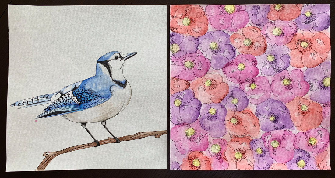
Concord (October 28th, 2019)
India ink and watercolour on watercolour paper
(11’’ x 11.5’’) x2
I chose to explore the relationship between watercolour and india ink. The title, Concord, relates to this by expressing the harmony between the two mediums. In this process I chose to complete two pieces as a series, to compare different compositions. The page of flowers without any negative space, and the simplicity of a single bird. In nature many things work together to become even more powerful as one, similar to the connection between the watercolor and ink used to create this work.
Hidden Beauty (March 4th, 2020)
Charcoal pencils and chalk pastels on mayfair drawing paper
(15” x 20”)
The intention behind this piece was to use colour in order to create impact; the contrast between black and white and the use of independently placed colour. In this case, the petals were in colour to represent the beauty that may not be initially noticed within a person. I was inspired by an image for a tattoo created by Molly Molzes.
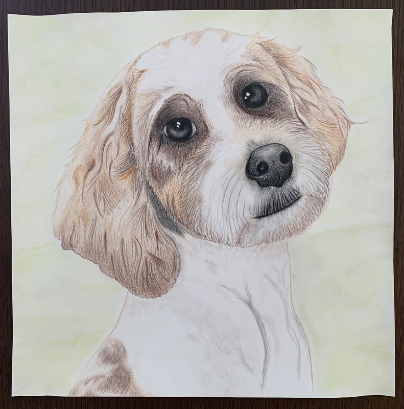
Oby (March 18th, 2020)
Coloured pencils and watercolour pencils on mayfair drawing paper
(11.5’’ x 11.5”)
Instead of focusing on the anatomy of a person, I wanted to try working on the anatomy of an animal. I chose to work from an image of my own dog. I explored the lines and texture of the hair through the use of coloured pencils. The intention of the background was to not only represent grass in a literal sense, but also the cheerful feeling presented by my dog, expressed through the movement of lines.
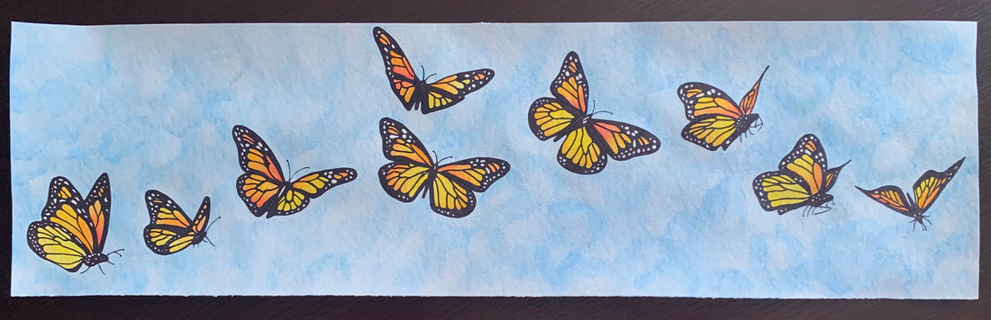
High Spirits (February 20th, 2020)
Black ink and watercolour pencils on watercolour paper
(8.5” x 29.5’’)
Butterflies have numerous symbols in people’s lives, whether it is the circle of life, freedom, hope, the passing of a loved one, or emerging as a better person. The intention of this piece was to have a light, lifting feeling. Watercolour pencils allowed me to blend the colours in the wings, as well for more control over the pattern and shading in the background. The black ink was used in order to create distinct bold lines on the wings to make the butterflies feel lifted from the background.
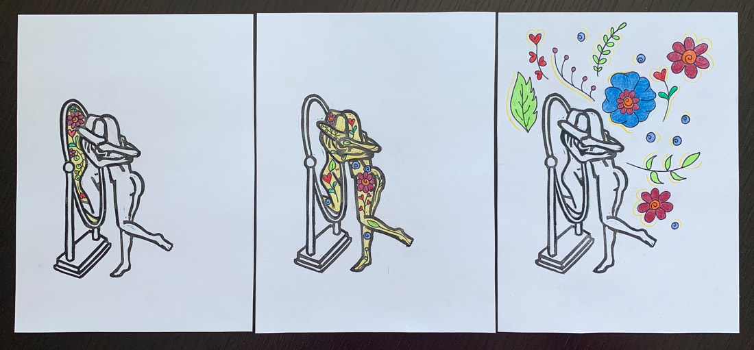
Self Love (April 2nd, 2020)
Coloured pencils and ink mayfair drawing paper
(8” x 6”) x3
I was inspired by digital art I saw on a social media feed that contained the outline of this image. I wanted to try to incorporate print making because of the distinct lines Self love and self image is such a significant aspect of everyone’s life. My intention was to demonstrate the development of someone loving themselves in the mirror for who they are. The flowers represent the love spreading out of the mirror and into the person’s life.
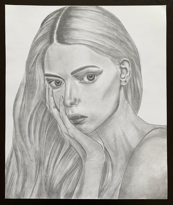
Unknown (March 26th, 2020)
Pencil on mayfair drawing paper
(14” x 12”)
I often find myself combining media or gravitating towards colour. For this piece I wanted to challenge myself with only the use of pencil. This way only grey tones were used and there would be no race or preconceived opinions based on appearance. I found an image from http://www.aljanh.net because I did not want to know the person I was drawing. I could solely focus on the features of her face and have no personal connection to this person, I only knew what the image showed me.
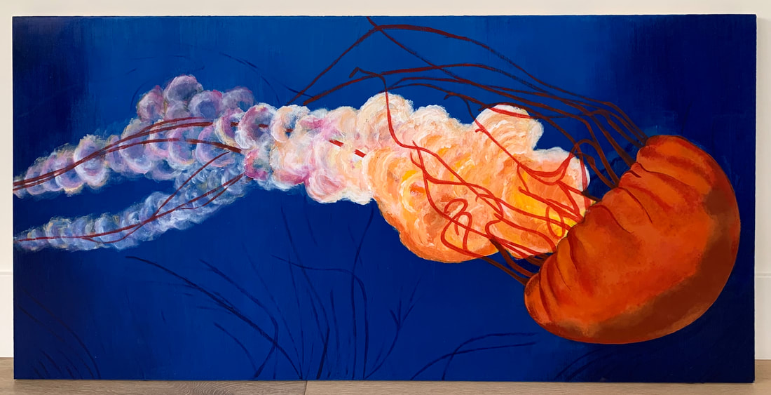
Depth (March 12th, 2020)
Acrylic paint on plywood
(60” x 35”)
I was automatically inspired by an image on CBC of jellyfish. I was drawn in by the contrast in colours and the movement of this underwater creature. In a time when the waters on our planet are so threatened by pollution and garbage, my intention was to capture the beauty of this creature to inspire others to have more love for our waters and the animals that call it home.
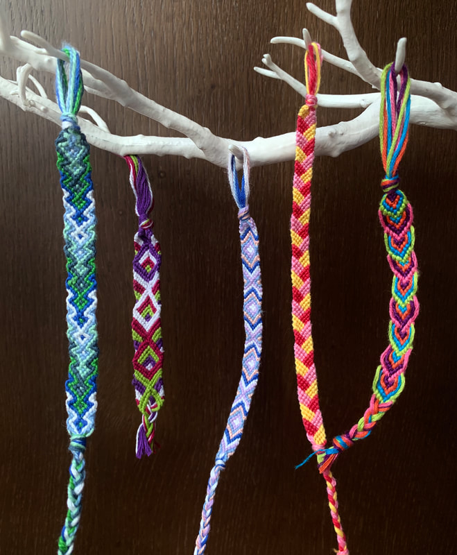
The Bond of A Single Knot (March 31st, 2020)
Embroidery thread
(12” x 8”)
Creating embroidery bracelets has been a love of mine since a young age. As I finish my last year of high school I wanted to pay tribute to my childhood and an artistic love of mine. A large part of my life growing up was summer camp. This is where I would often complete the most bracelets, as I was pulled away from distractions and technology in everyday life. The individual knots making up the patterns represent the many different aspects of my life that have made me the person I am today.
