The theme of my body of work is of differing perspectives and interpretations. Features are visual explorations of aspects of humanity and nature. Liberation is based around the concept of opening up to others by breaking open the tough exterior built up by the figure depicted. By opening them up, you see their true selves, represented by the plants. Nature vs. Synthetic explores the idea of the digitalization of nature by having a side-by-side comparison of a photograph of a monarch butterfly on a leaf to the digital painting of said image.When experiencing the collection, I intend for the viewers to compare their interpretations of the concept with mine. By doing so, I intend for viewers to see the world through another person’s eyes to gain a broader sense of perspective.
Acrylic paint is the material that I am the most familiar with. They produce vibrant colours, which is why it is my material of choice for creating art pieces. That characteristic of acrylic was key for Untitled (Rising Phoenix). In the piece, I wanted to recreate the birth of a new phoenix. The bright red, orange, and yellow hues created with the acrylic paint make the phoenix appear young. I have less experience with watercolour than with acrylic paint. While acrylic creates more vibrant tones, watercolour creates more muted pastel tones. Which is why I used it in Evanesce. This piece is of a female fading into her own reality. Not only do the muted tones give the piece a softer look, but it also enhances the look of fading, as the female has a softened skin tone. Through the grade 12 year, I began using the digital art software, Krita, to create art. One thing I found with digital art is that you can easily emphasize artistic elements such as for, colour, and line. In Antithesis, I emphasized colour and value to highlight the differences between the two characters. For fire. I used warm tones such as red, orange, and yellow and made the light source a fire. For Ice, I used cool tones such as various hues of blue, and made the light source of an ice staff and some ice spikes, emphasizing the ice. For Liberation, I wanted it to be the most expressive piece, as I intended for the viewer to feel as though they were opening up the figure. To get that effect, I made a sculpture out of clay. Throughout the creation of this piece, I was able to experiment with different methods of sculpting clay. One was the coil method, which I used for the body.
In my exhibition, I wanted to split my works into two parts, pieces with more human attributes, and pieces with more natural attributes. With the pieces with more human attributes, the concepts behind them are more of the human experience and concepts of human psychology. I want Liberation to be presented first as it is a piece about opening up, and the pieces that follow are considered to be aspects of the figure’s character. One aspect is they are hurting from a loss, The Loss of Happiness. Another being the figure has a character that is opposite to yours, Antithesis. The last aspect is that they are in their own headspace, their own world, Evanesce. With the pieces with the more natural attributes, the concepts behind them are more obscure, and deal with both fictional and realistic ideas concerning nature. Eyeception would be presented first, as it is a smooth transition from the human section, its concept being the eyes are the window to the soul. Summer would be next, since both it and Eyeception connect to my heritage, which is part Jamaican and part Guynease. Next would be Untitled (Rising Phoenix). Compared to the last piece, it is a warmer toned piece with a more obscure concept. Then Natural vs. Synthetic since the concept is more ambiguous, and it creates more variety in colour palettes and media. I want to end on Opposing Realities as it is based on the theory of alternate realities. It leaves the viewers thinking about the world. This collection intends to grow the viewer’s perspective, even the slightest bit.
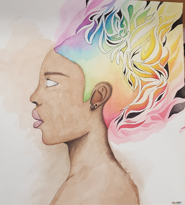
Evanesce (November 2019)
Watercolour Paint and Lining Markers on Heavy-Textured Watercolour Paper
43.2cm by 48.9cm
“There in body, but not in mind or spirit.”- Rika Rao
I interpreted the quote above as an individual fading out of reality. A female with soulless eyes is fading away by splitting into pieces and flowing out of the lines and out the piece. She is slightly pale, the effect given by the watercolours used, to show the lifelessness of her body as she is not physically "there" anymore. Her skin tone is also bleeding out of the lines as she is leaving her body.
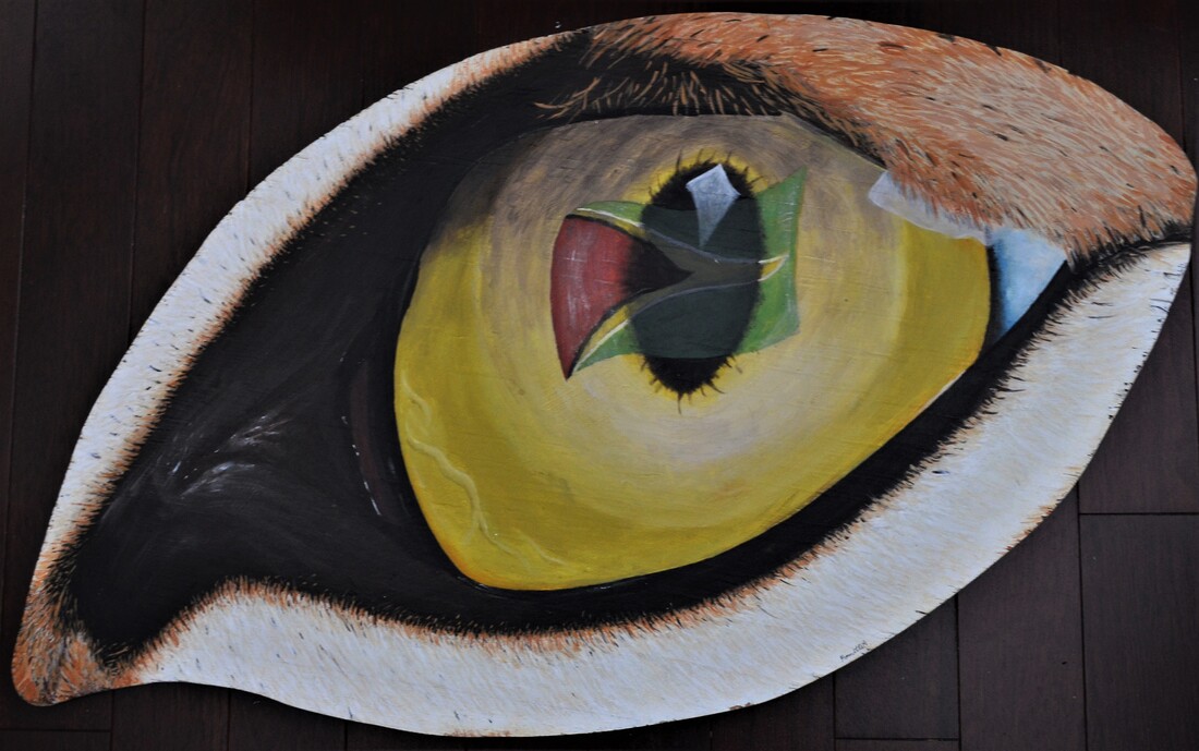
Eyeception (February 2020)
Acrylic Paint on Eye-shaped Wooden Panel
88cm by 49cm
“The eyes are the window to your soul.”- William Shakespeare
This piece is my interpretation of the quote above with a cultural twist. It is painted in a human eye shape to represent me, a Guynease individual. By looking into my eye, you see the eye of a jaguar. A Guyanese flag is inside the jaguar's eye since the jaguar is the national animal of Guyana; thus, making Guyana the soul of the jaguar, and of me.
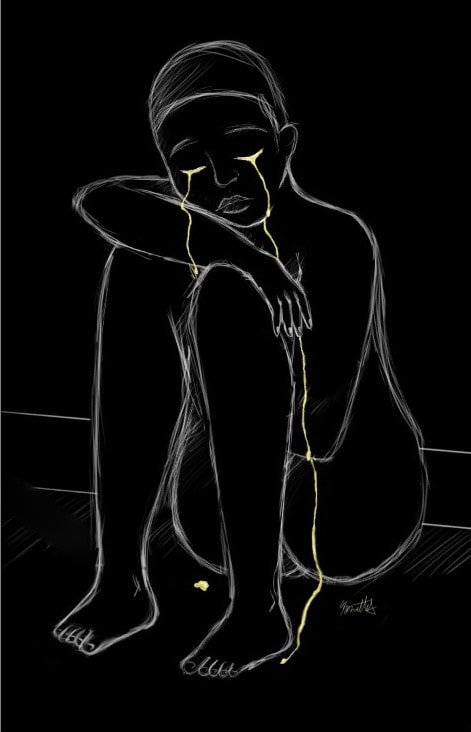
The Loss of Happiness (December 2019)
Digitally illustrated using the program Krita
706px by 1105px
A depiction of an event where I lost a sense of happiness. Consists of a monochromatic figure crying yellow tears. The monochromatic aspect of the pieces is a representation of the world losing its colour; the figure’s world is now full of sadness. The tears being yellow represent the figure's happy emotions. Since they are crying them away, they are losing those emotions.
|
|
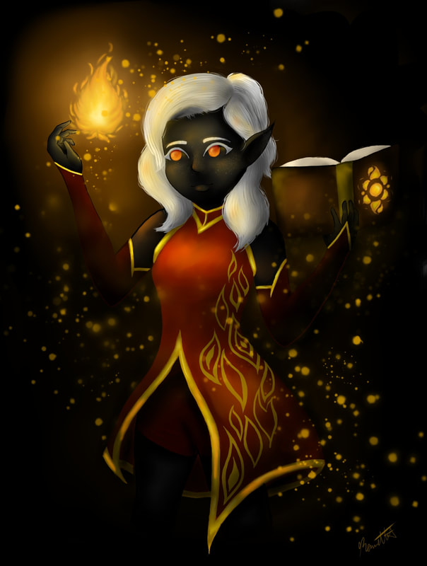
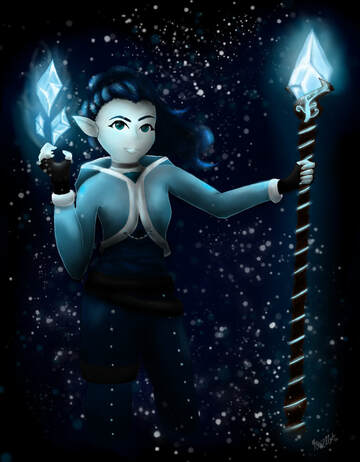
Antithesis (February 2020)
Digitally illustrated using the program Krita
1113px x 1475px and 1250px x 1604px
A person or thing that is the direct opposite of someone or something else.
This piece is a visual representation of the word antithesis. The piece consists of two opposing personified characters; a fire mage and an ice sorceress. The fire mage’s colour palette consists of warm tones, has a darker skin tone, and is holding fire. Whereas the ice sorceress’s colour palette consists of colder tones, has a lighter skin tone, and holds ice. These differences are to further emphasize the idea of the two characters being complete opposites of each other.
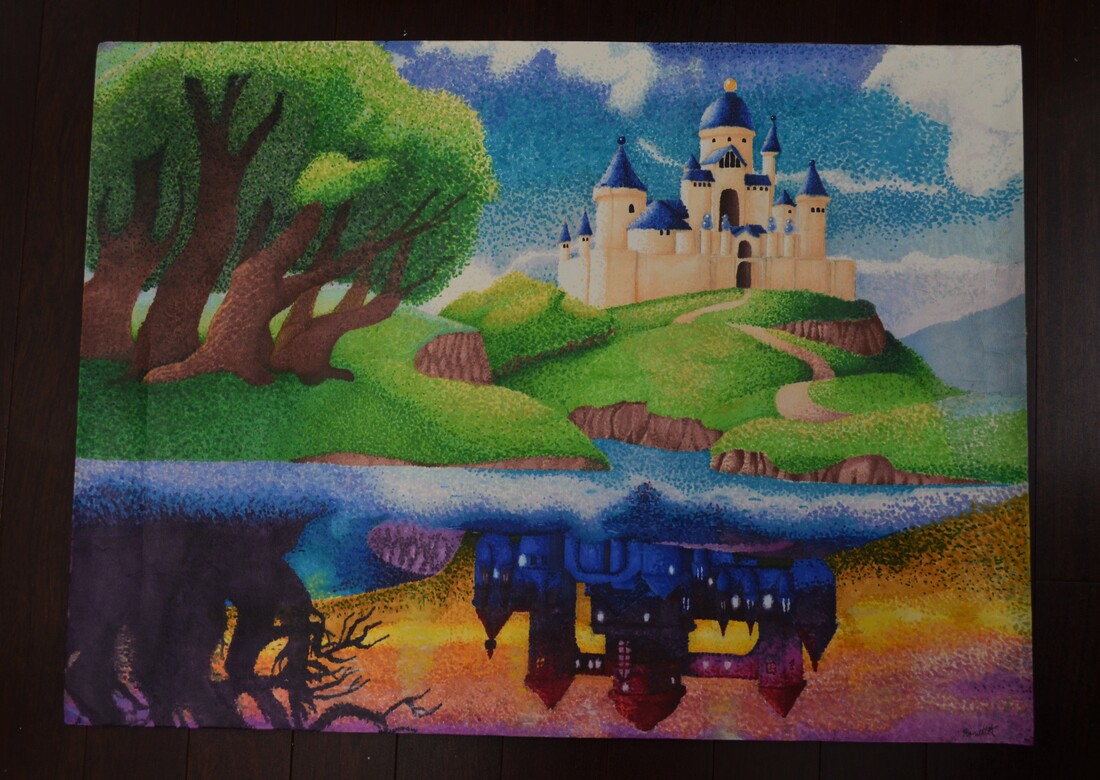
Opposing Realities (January 2019)
Markers on High-texture Watercolour paper
76cm by 56.25cm
Inspired by the game Legend of Zelda: A Link between Words, this art piece explores the idea of there being alternate worlds. Consists of a landscape with a landscape looking over a lake, with the reflection of a similar scene. Contrasting colours were used to indicate a parallel reality being reflected in the lake. To add a surreal effect to the obscure concept, the piece was done with the pointillism technique, drawing inspiration from The Pink Cloud, Antibes by Paul Signac.
|
|
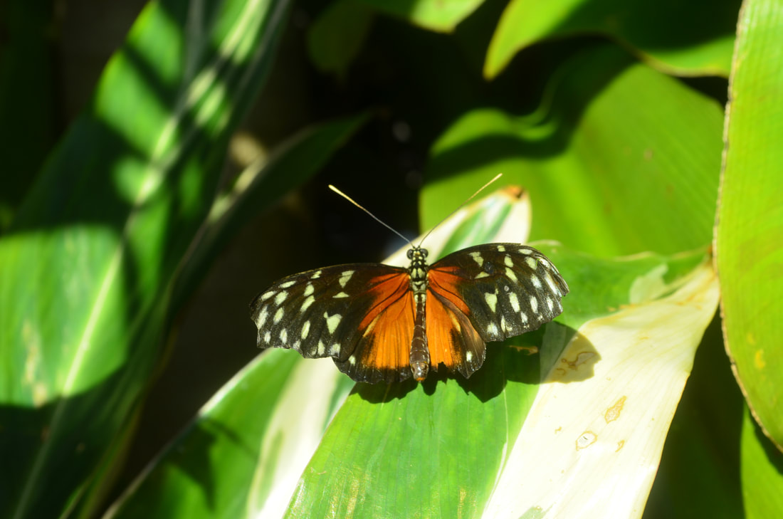
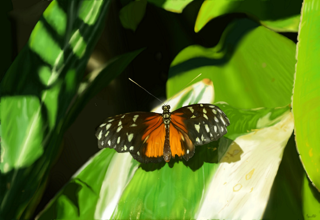
Natural vs. Synthetic (January 2020)
Photography and Digital illustration using the program Krita
1700px x 1170px and 4928px x 3264px
To what extent can technology mimic naturally occurring objects?
To try to answer the question above, this piece is a comparison of a photo of something from nature to a recreation using digital technology. One image is a photograph I took of a monarch butterfly on a leaf, the other is a digital painting of said photograph. By recreating a butterfly on a leaf by illustrating it using technology, the experience of nature is dubbed down to just a simulation of such.
Could you tell the difference?
|
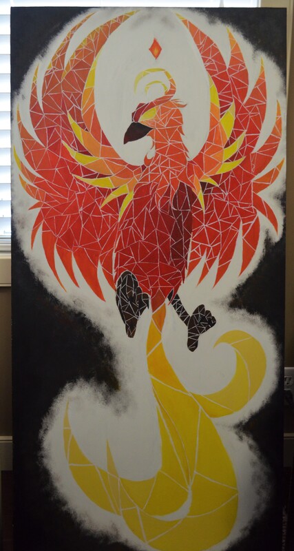
Untitled (Rising Phoenix) (April 2020) Acrylic paint on Wood 61cm by 122.3cm This piece explores the lore behind the phoenix, a mythological fire bird that is said to live up to 500 years. Once a phoenix is near the end, it creates a nest and engulfs the nest, and itself, in flames. After death, a new phoenix rises out of the ashes. This piece is a depiction of the rise of the new phoenix. The geometric shapes within the phoenix show its precise structure. Since this phoenix is an exact copy of the previous one, the structure must be as close to the first one as possible. |
Summer (March 2020)
Acrylic paint on Canvas
45.8cm by 35.4cm
A part of a collaboration series where we took a season and depict what it means to us. My season was summer. Summer reminds me of my time living in Jamaica as a child. Thus, this painting is of a park I visited as a kid in Jamaica. I depicted the cooler side to summer by enhancing the green and blue hues. This is to show my preference towards the cooler aspects of summer, such as the shade, rather than the heat.
|
|
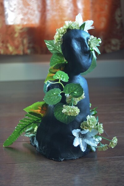
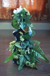
Liberation (April 2020)
Sculpture made of clay, adorned with fake plants
22cm by 19cm by 23cm
A visual representation of my experience with opening-up, exposing one's true self. The black figure itself is the outer shell people show to those not close to them. The holes in the figure show that they are beginning to open up. The plants pouring out of the cracks in the figure is their true self coming through that shell. Within the plants are white flowers, symbolizing the purest form of the figure, and beige flowers, symbolizing warmth with the figure's character.
